We kicked off 2022 with an amazing workshop for a brand new high-end, custom builder brand from Melbourne. The team from the soon to be named ‘Cape Group’ came to the workshop brimming with ideas and enthusiasm, and shared their vision for a building company that would be simultaneously luxurious yet relatable – a brand that shares a shares a passion for quality and design excellence with it’s clients and takes them on a 5-star journey from start to completion.
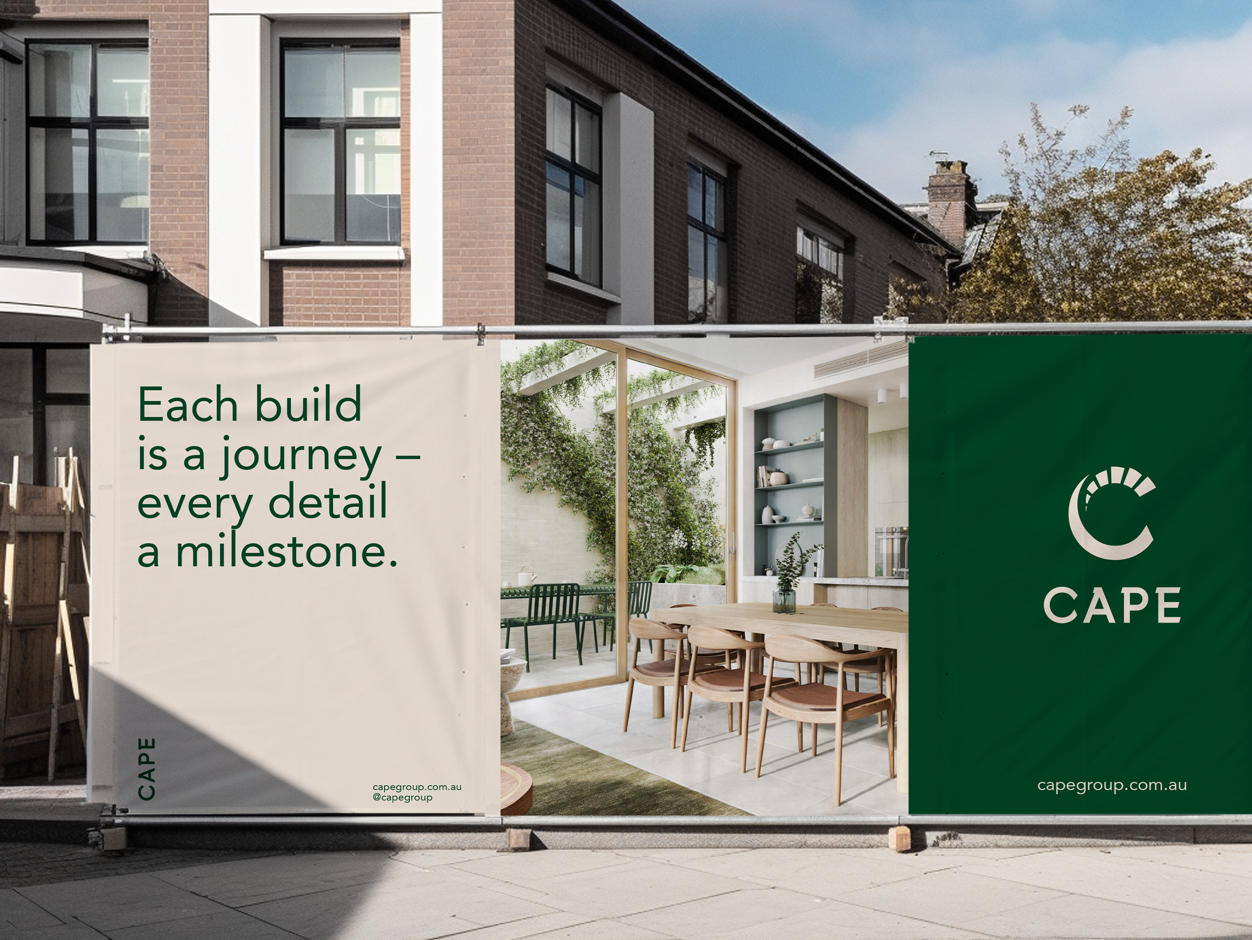
The resulting brand was anchored in a refined palette of deep greens and creamy neutrals, a simple custom logo mark talked to the pleasing combination of precision detail and simplicity. It was anchored by a refined palette of British Racing Green combined with a set of creamy neutrals sourced from luxurious natural materials.
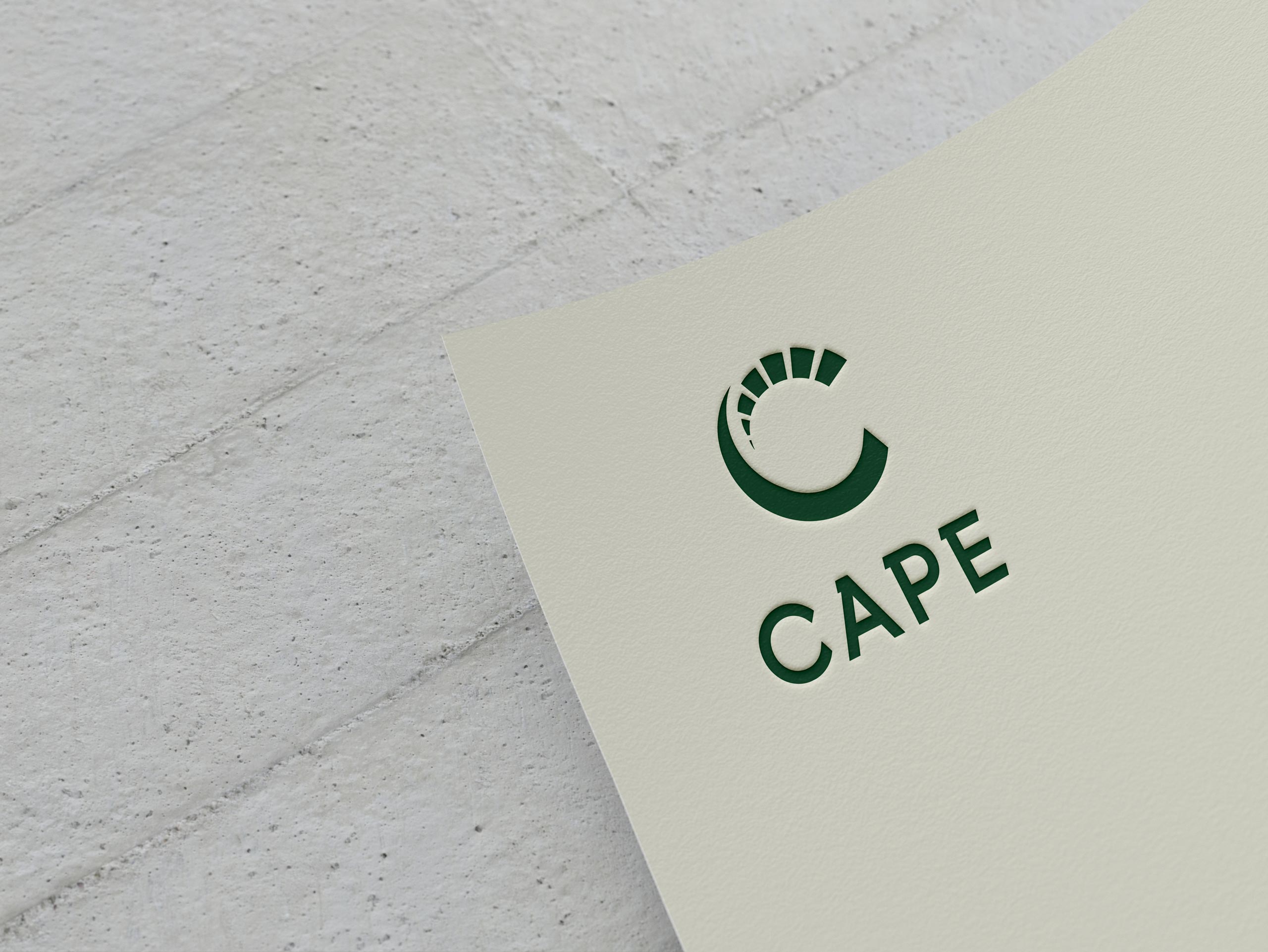
We developed a custom logo comprising a modern capitalised wordmark with a chiselled serif detail to highlight Cape’s values of precision, design detail and simplicity, together with a sculpted C icon, twisting like a circular staircase.
The Cape team genuinely enjoys solving problems and making things happen, keeping their clients tightly inside the ‘need to know’ circle and sharing their knowledge and expertise. Wo we crafted a tone of voice for Cape Group that was at once aspirational and unexpected, but also conversational and frank.
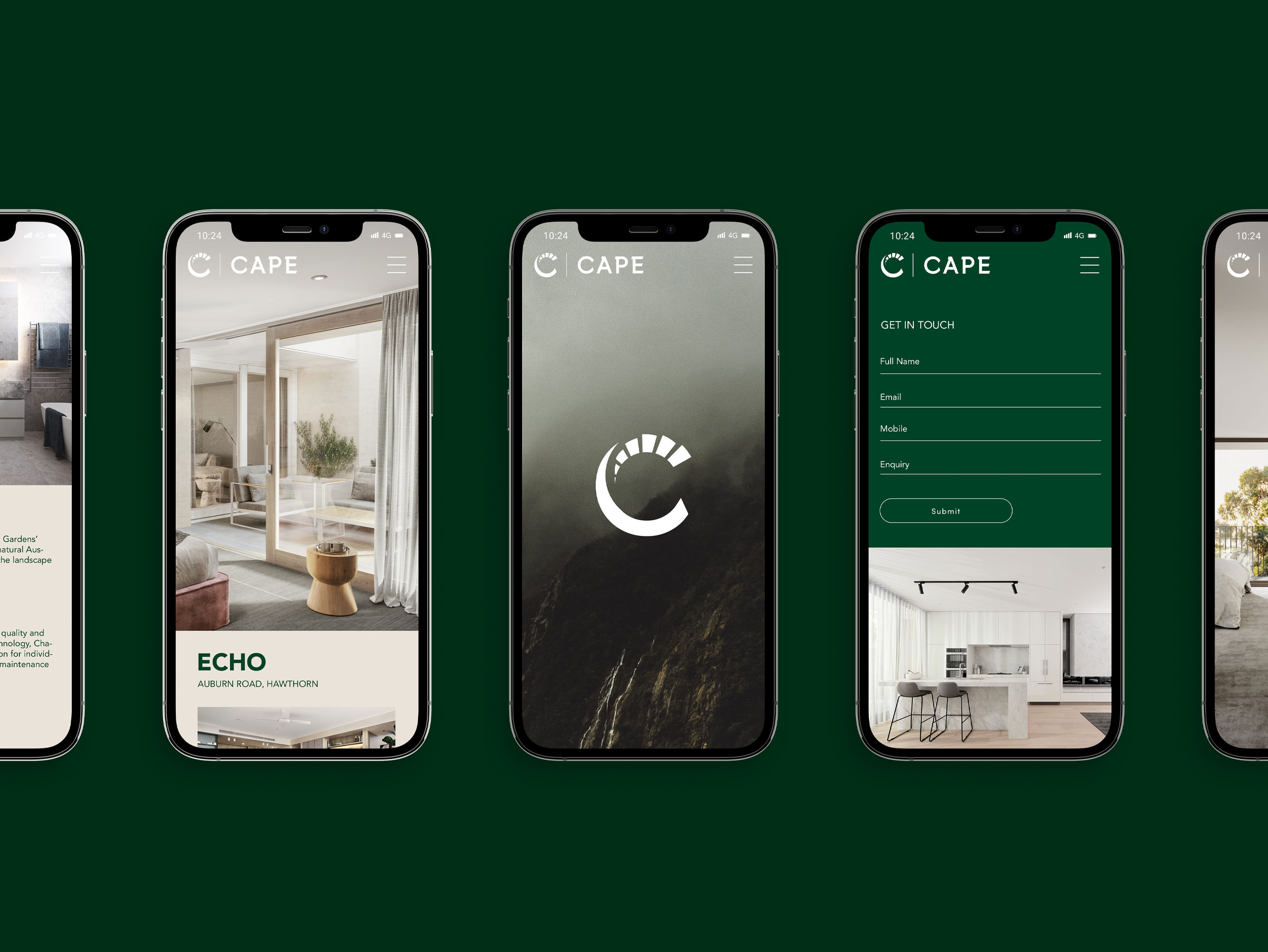
Ask anyone at Cape what industry they are in and you might be surprised to hear them answer ‘the service industry’ rather than the building industry. We approached the Cape website design along this same line of thinking – a simple showcase of track record and approach that was easy to explore and understand in a matter of minutes.


