“When it comes to embedding a sense of place in new buildings, context is everything. By drawing on the local built character, the tones and textures that exist in the natural environment, as well as the culture of the local community, we can shape an outcome that connects people and place, and just feels ‘right’.”
Metro is a local Australian property developer with projects at various stages across Victoria, Queensland and New South Wales. Established over a decade ago the brand had an old school corporate feel, relied on dated stock photography and was inconsistantly used across the group. Our first task was to bring the brand inline with the spirit of it’s team and their highly localised approach to development.
The navy blue, grey and gold gave way to a deep charcoal, golden yellow and crisp white. The logo simplified. And a new website experience that neatly conveyed their work and expertise was designed and developed.
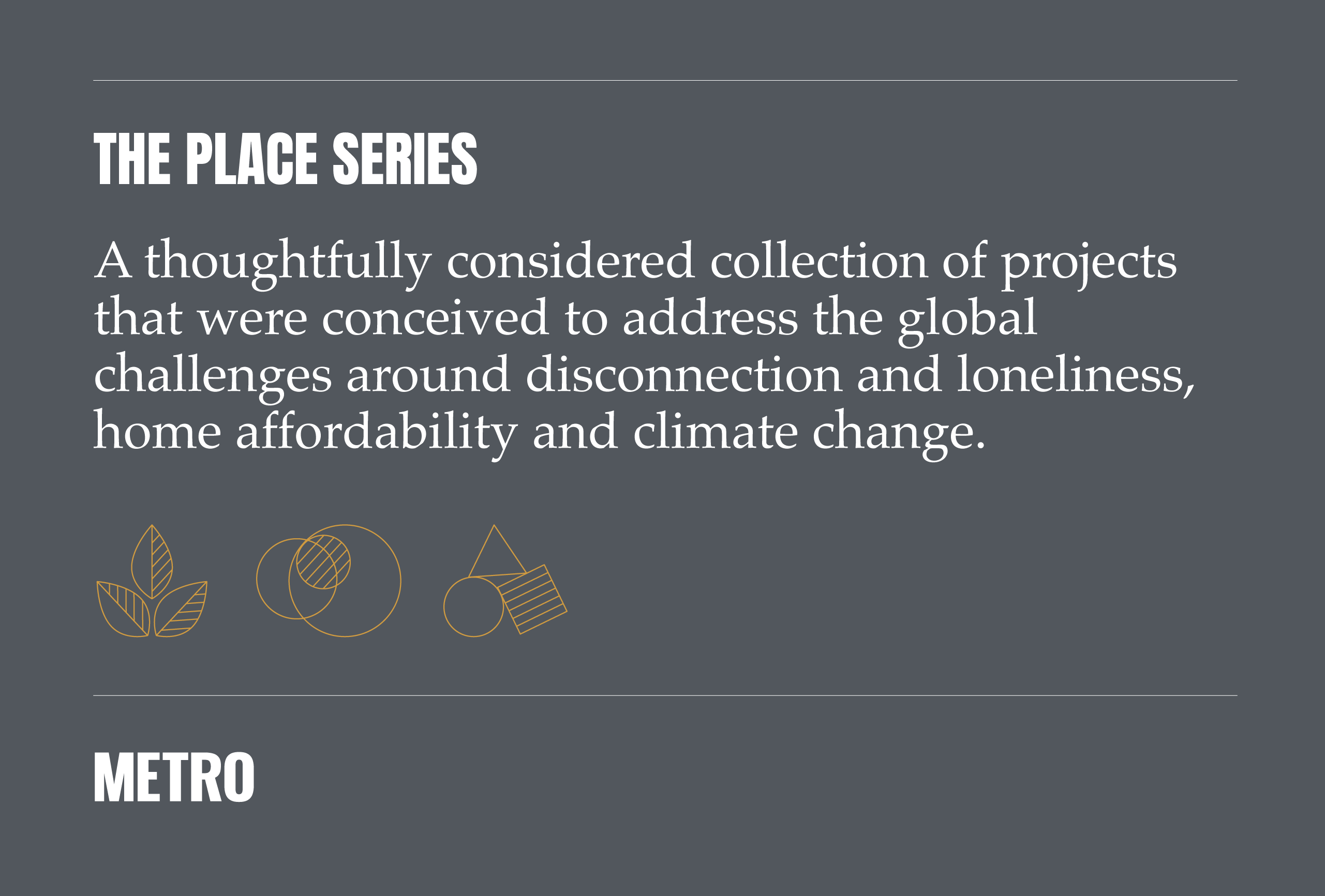
Then, working closely with the team in Victoria, we created a strategic and ownable market positioning that would resonate in contemporary markets and would be an authentic reflection of both their expertise and purpose. And so The Place Series was born – a thoughtfully considered collection of projects that address the global challenges around disconnection and loneliness, home affordability and climate change. The first two projects within the Place Series are now settling, two are under construction and the fifth is approaching launch.
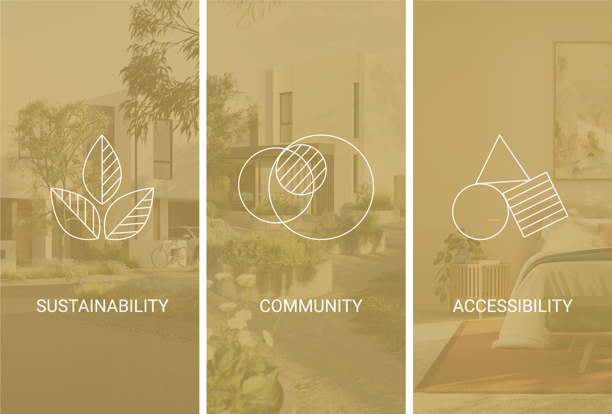
At its foundation, each project within the Place Series is designed and delivered with a genuine intention to foster human connection, support the local ecology, and providing real value to local owner occupiers. This packaging of features provides Metro with a unique and clear story. As each project is delivered it adds further proof to their model and trust in their promise.


