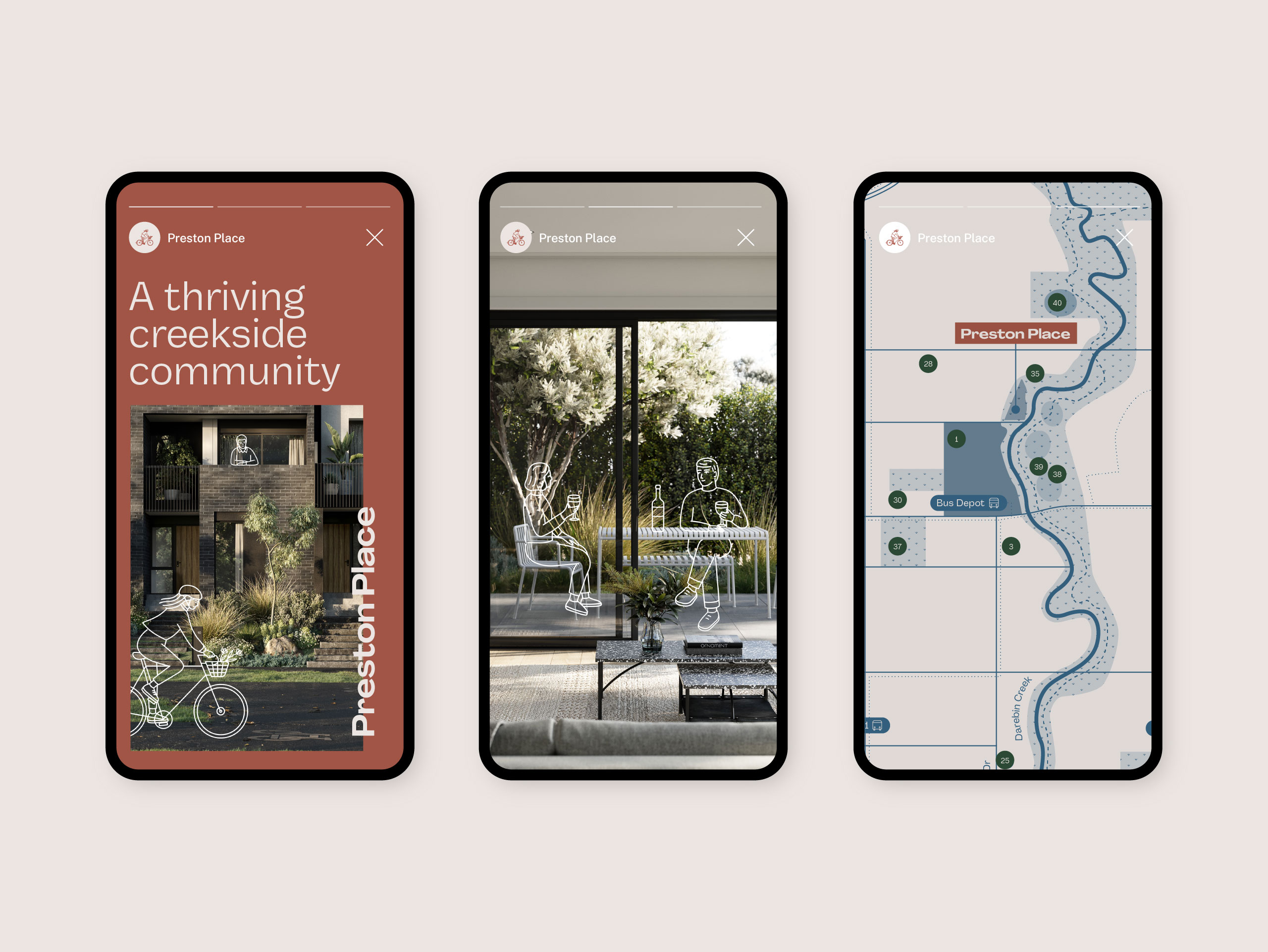
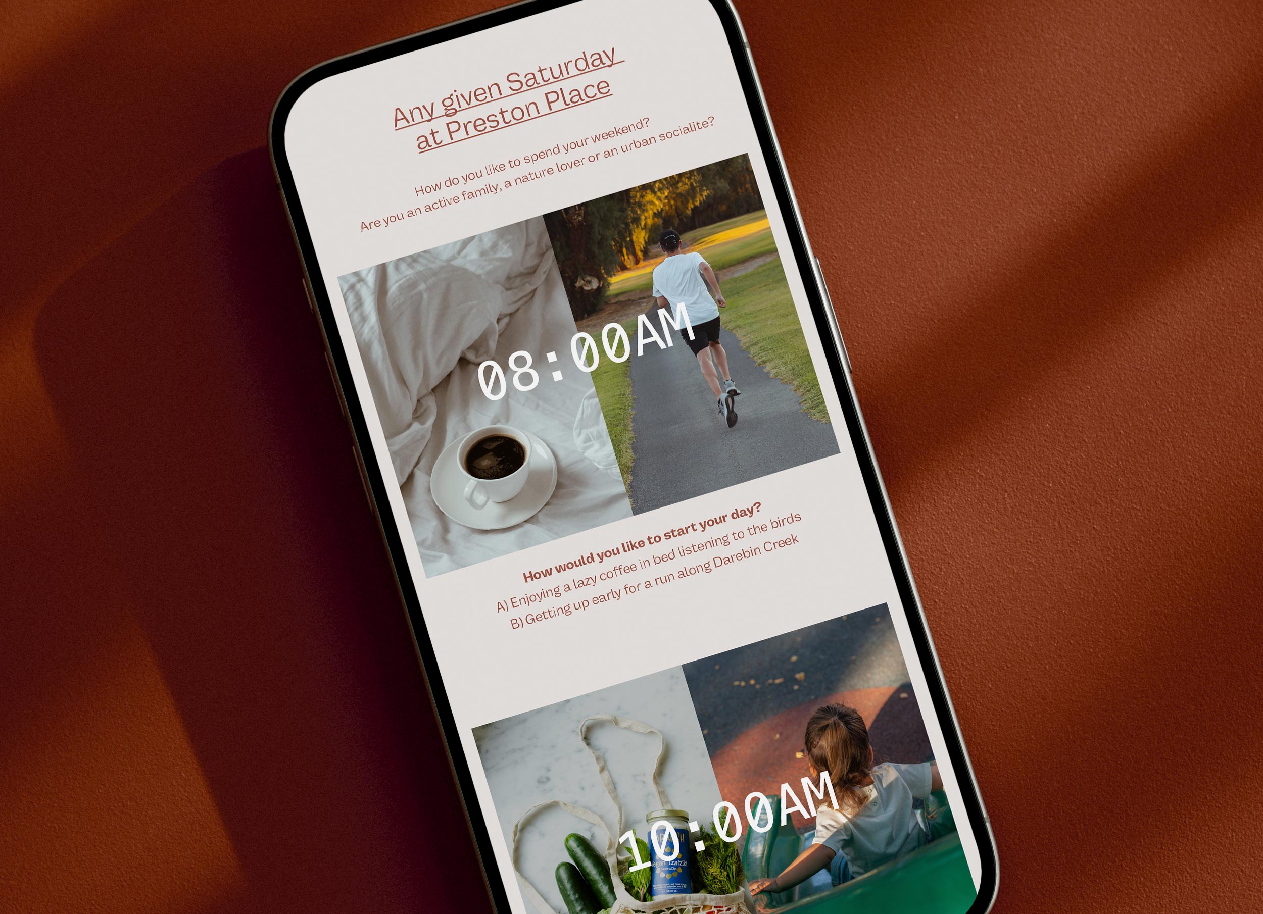
We absolutely loved creating the branding for this very special project and being involved from its conception. It’s a project that has had a genuine commitment to community and ESD embedded from day one.
The project started, like all good projects, with a team workshop to co-create a vision, and a set of measurable targets. We worked with the teams at Metro, ClarkeHopkinsClarke, and AKAS to talk through the natural, social, cultural context of the site and how we could create something that would add value to the area and the lives of occupants. At the end of the session we had a shared plan for a thriving creekside community that would deliver residents a home which costs less to run, lots of green space to support play, wellbeing and the local ecology, and a masterplan that would put people before cars and liveability at it’s core.
To be frank, it’s easier to build a brand around a great product. Something you know people will love regardless of how fancy or eye-catching the marketing is. If you start with something meaningful to the local audience, that will win hearts and minds, your job is half-way done.
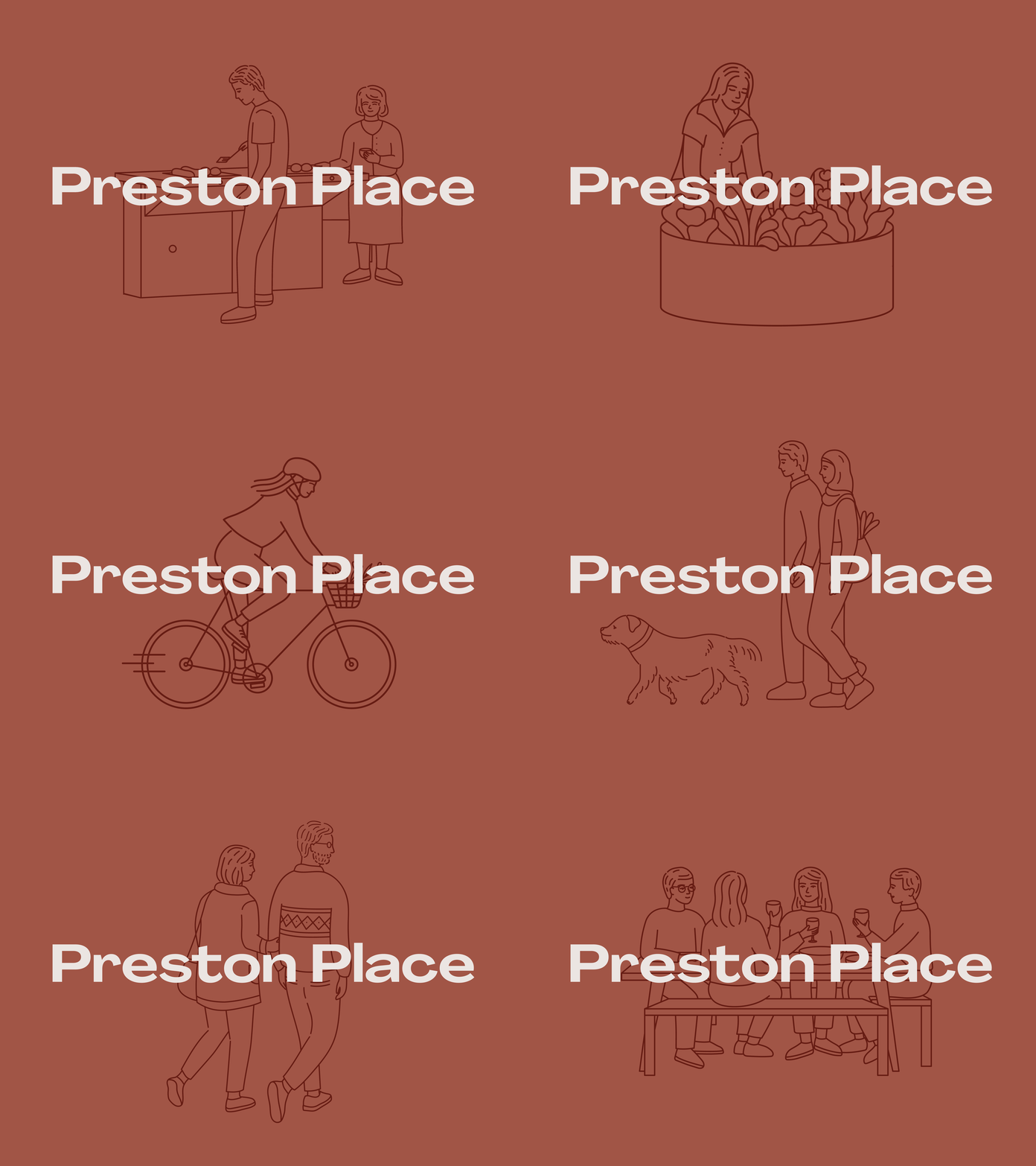
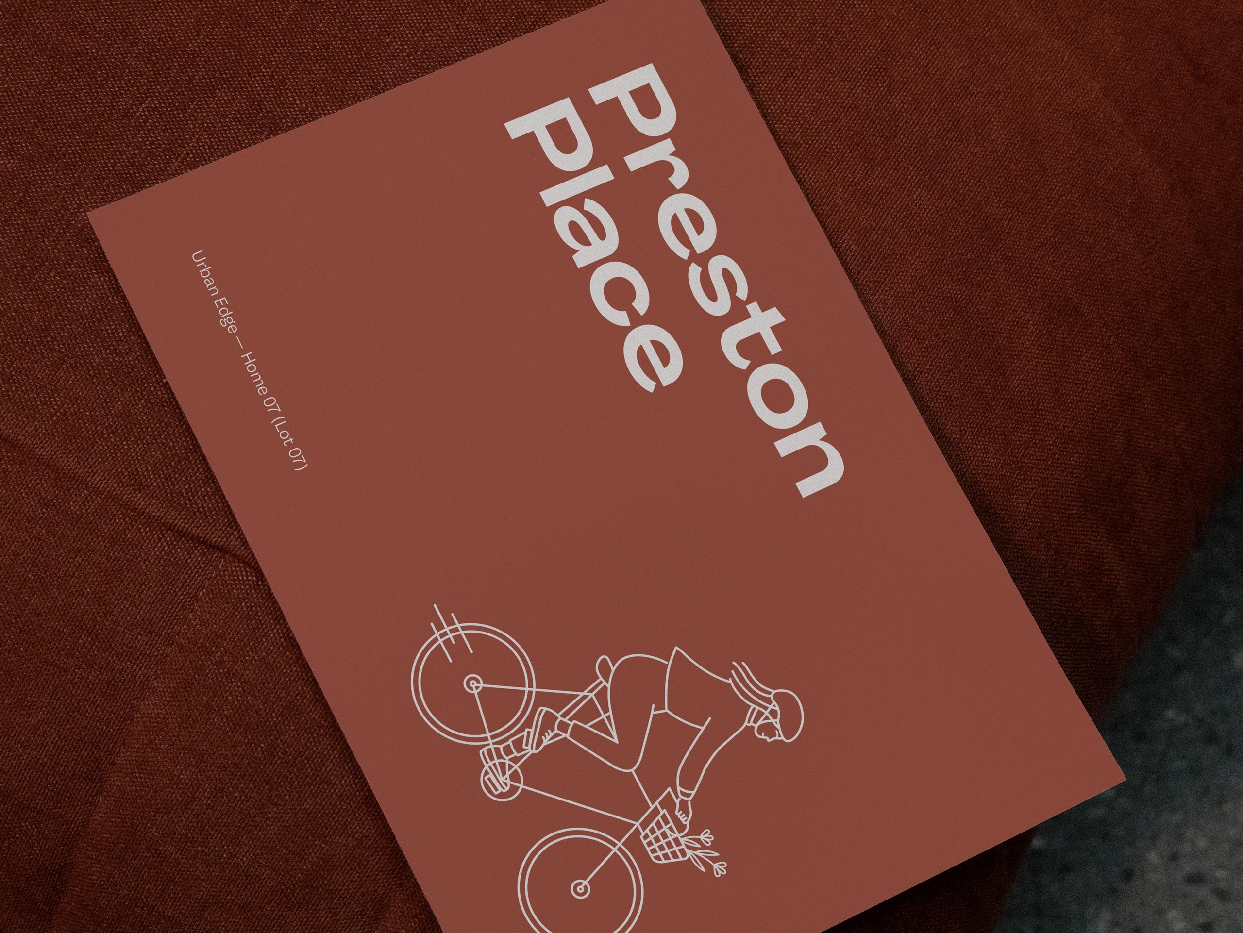
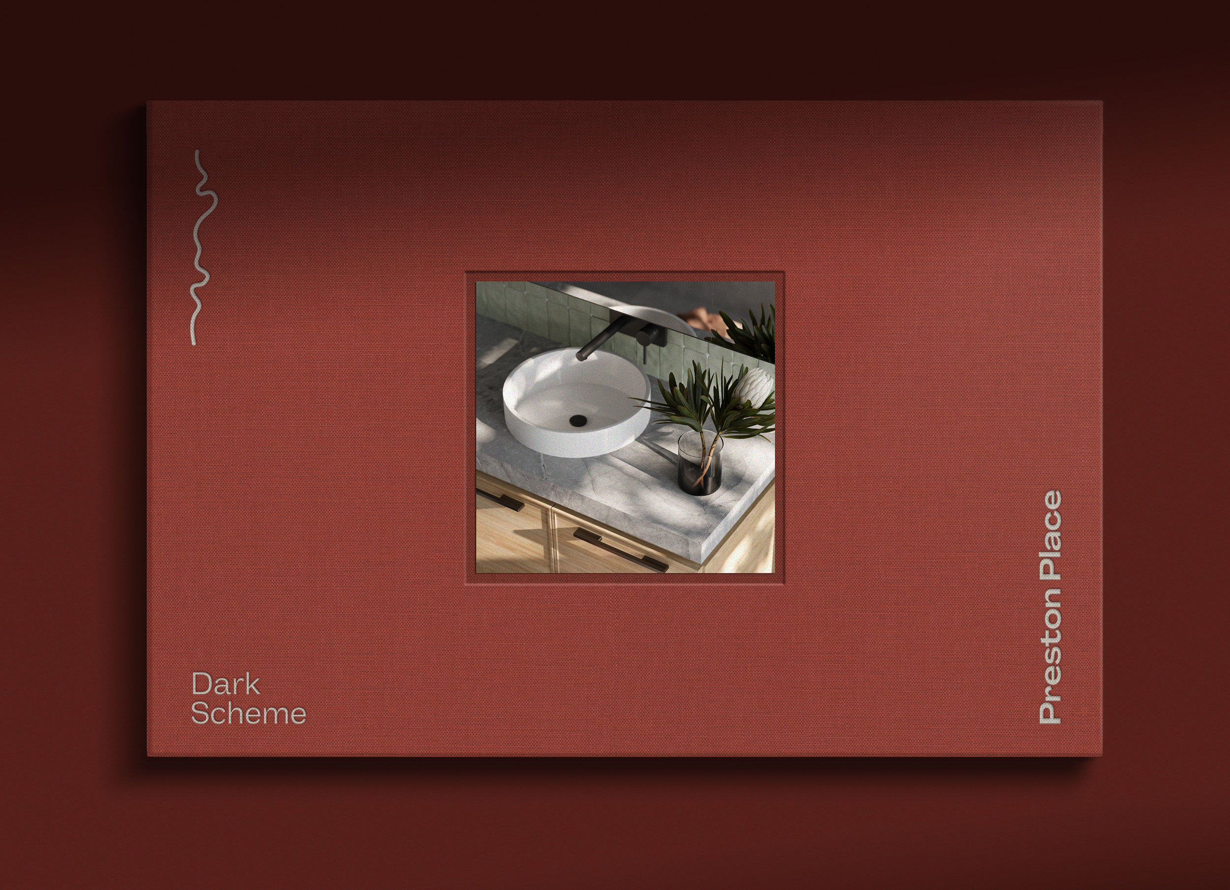
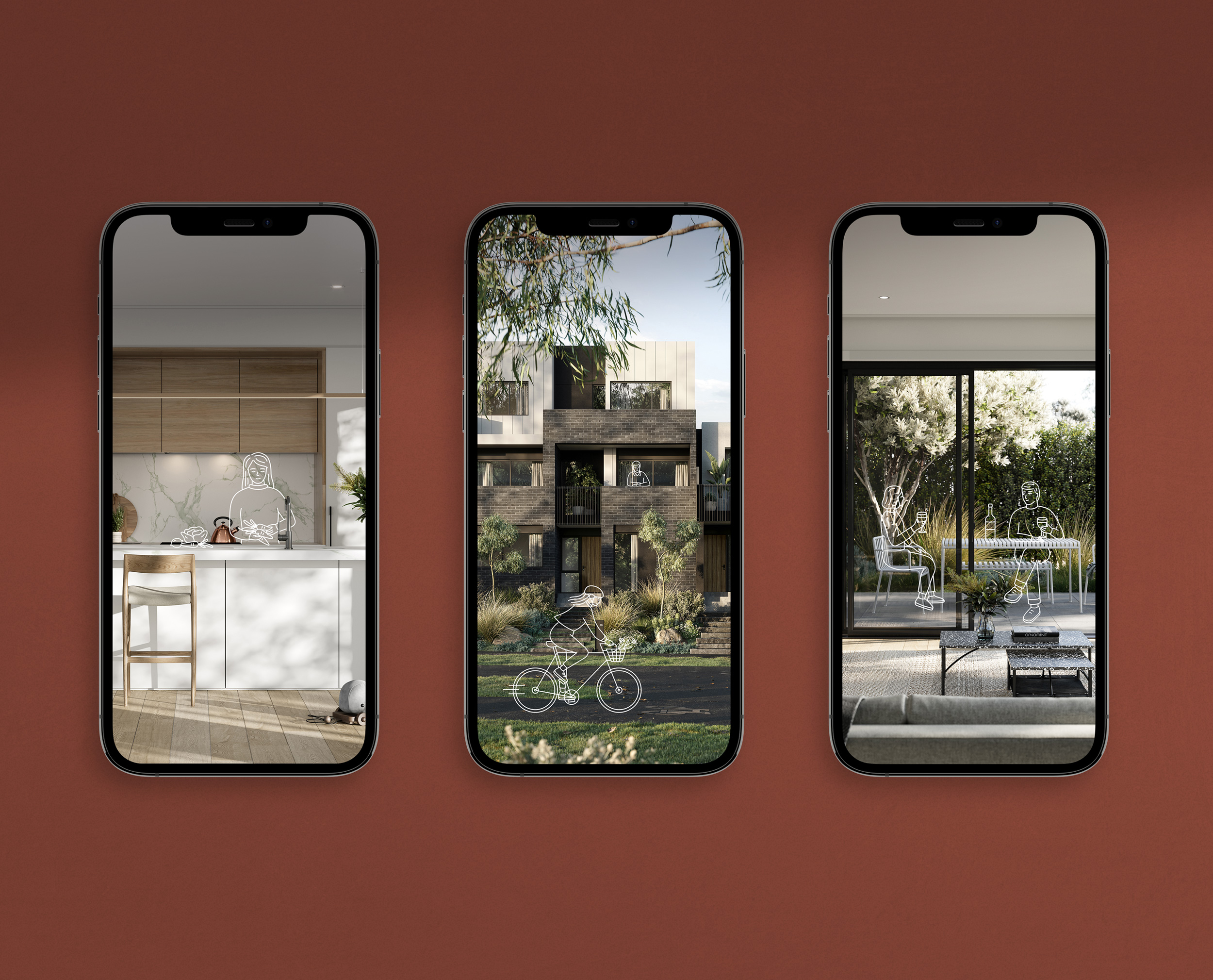
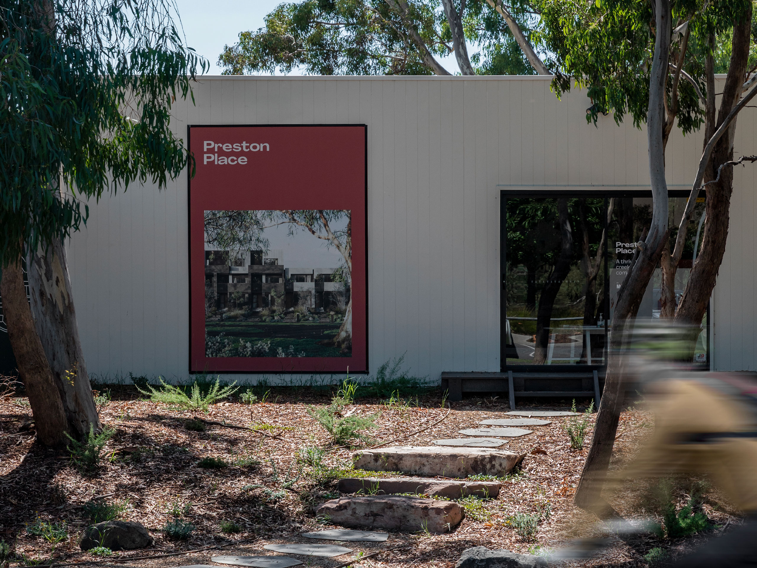
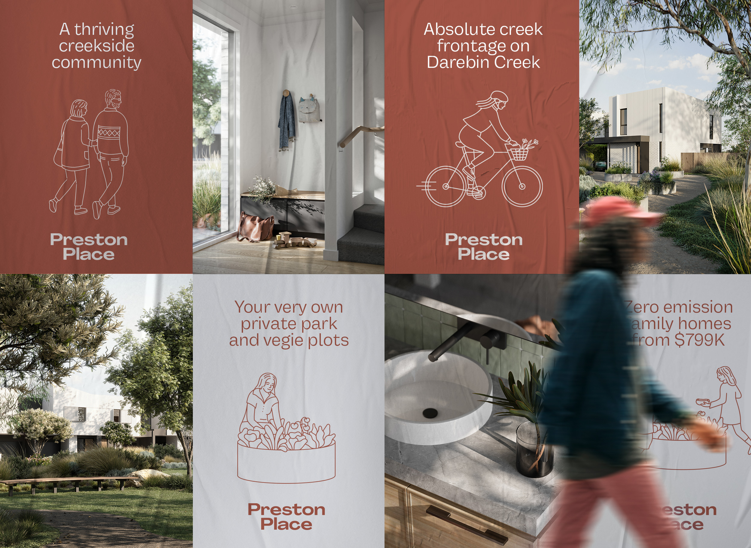
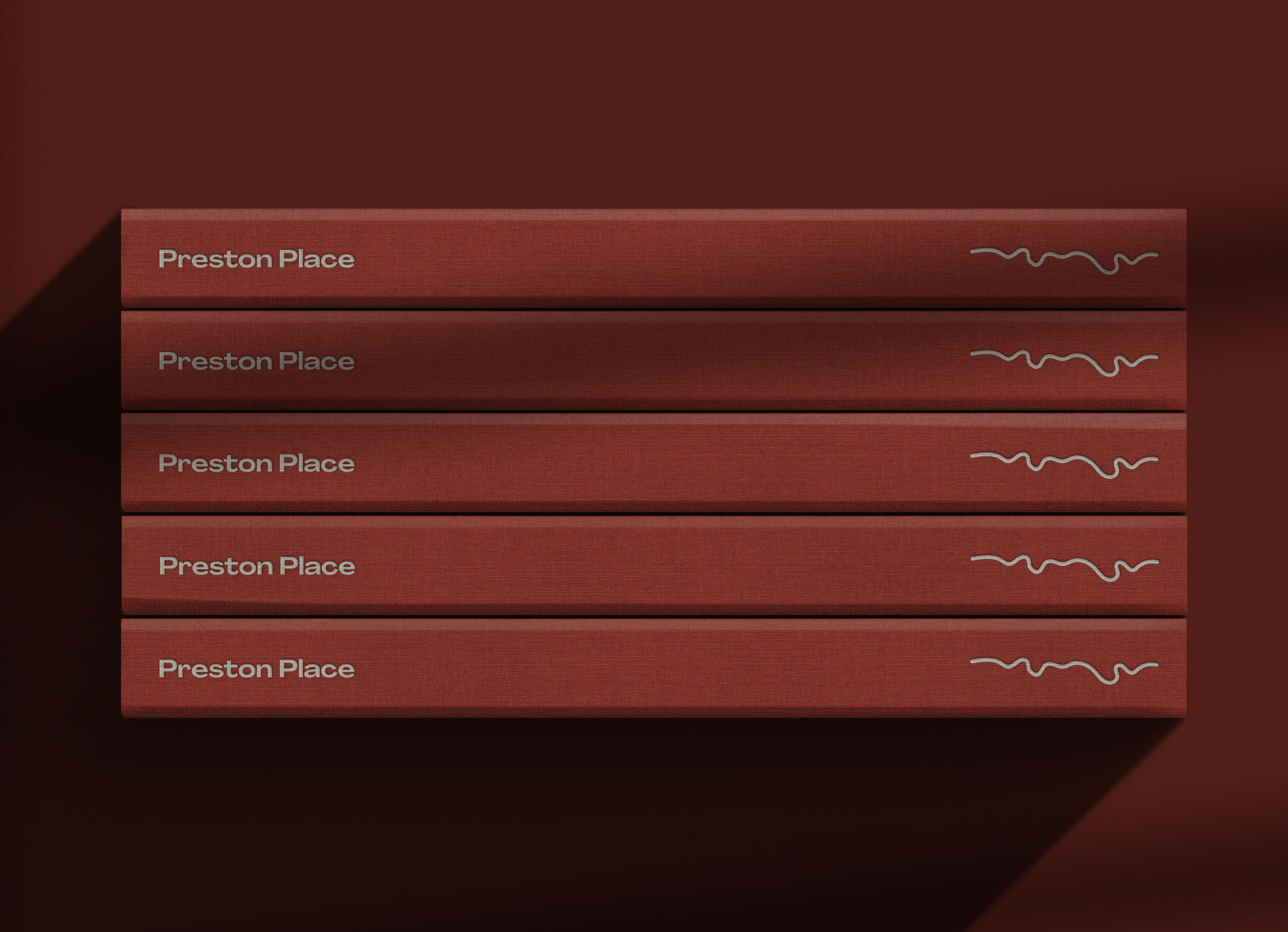
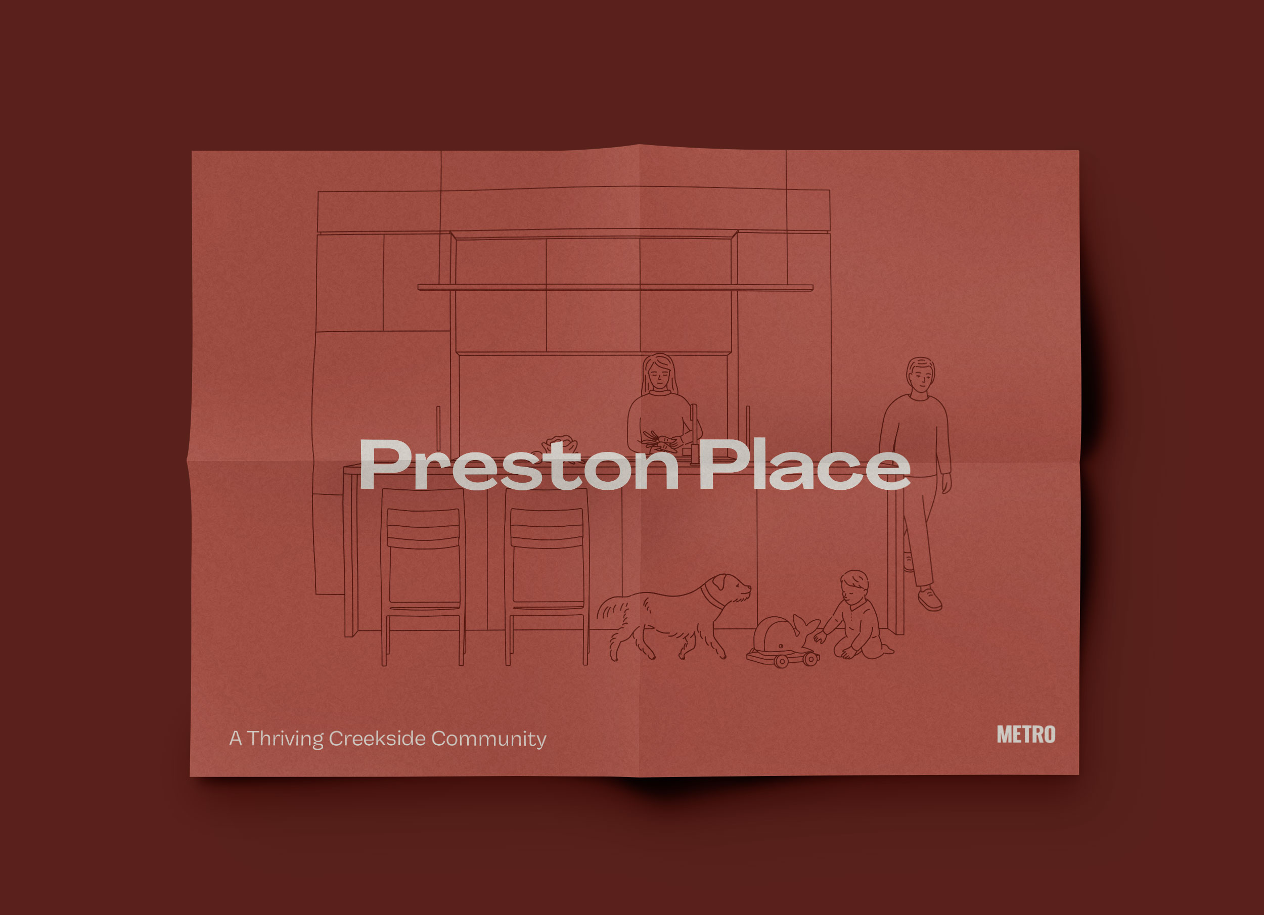
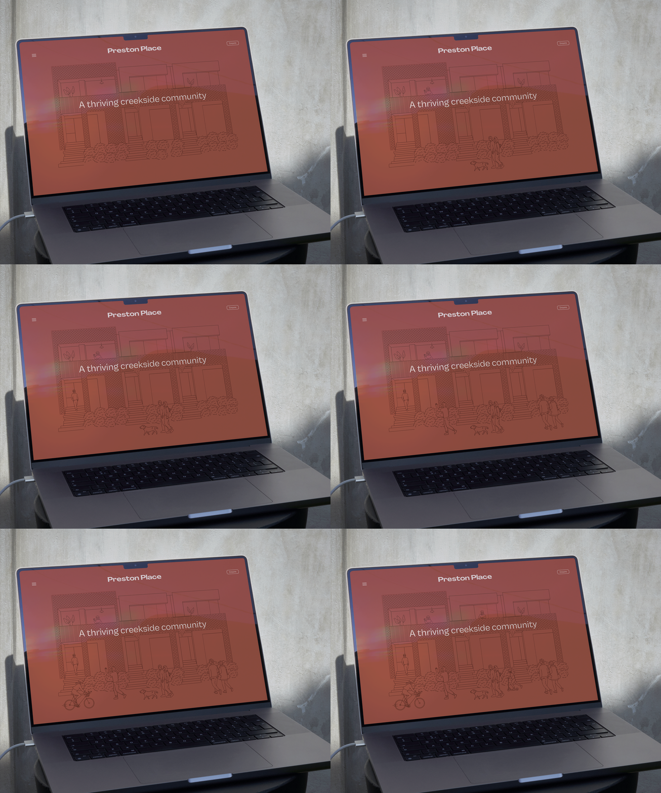
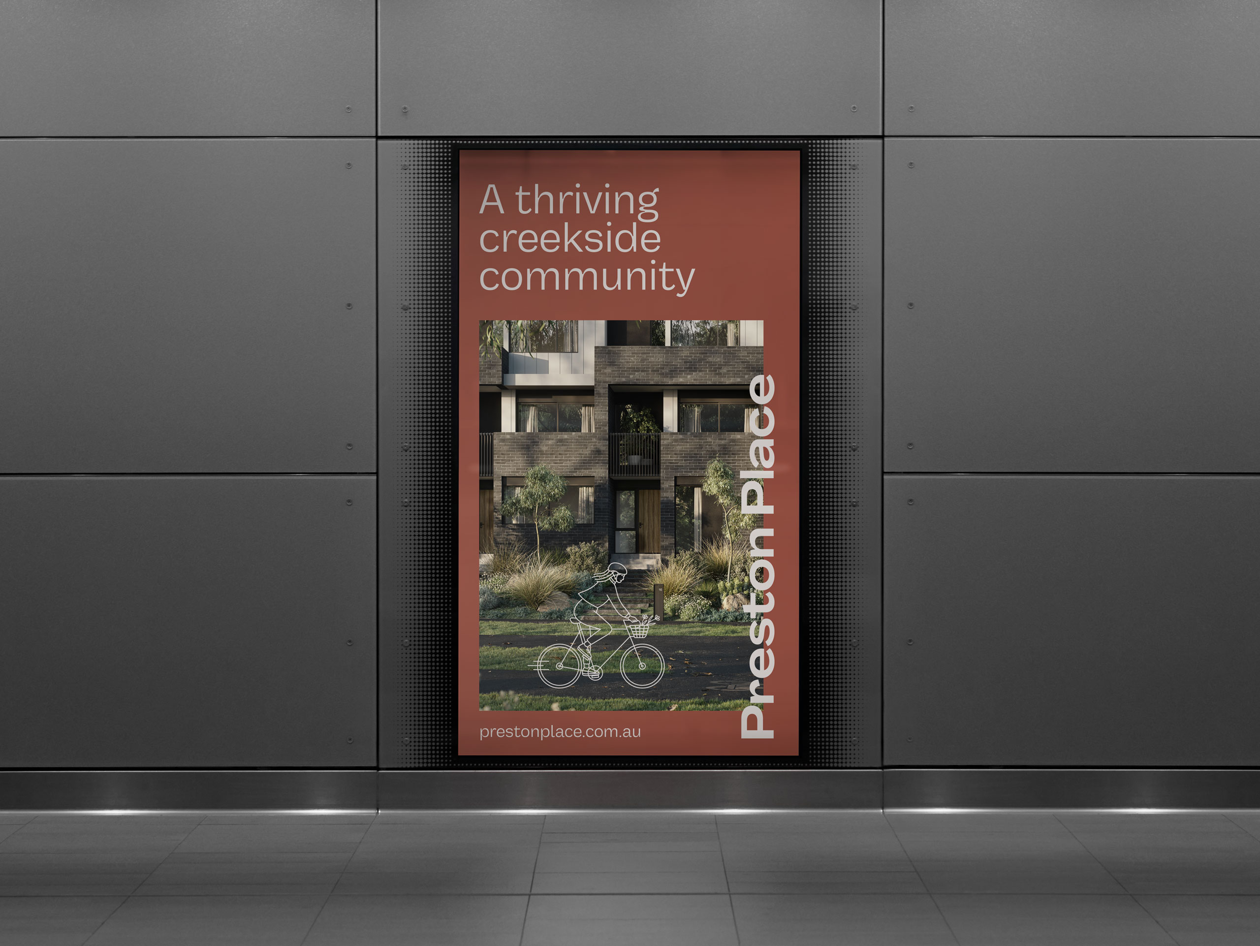
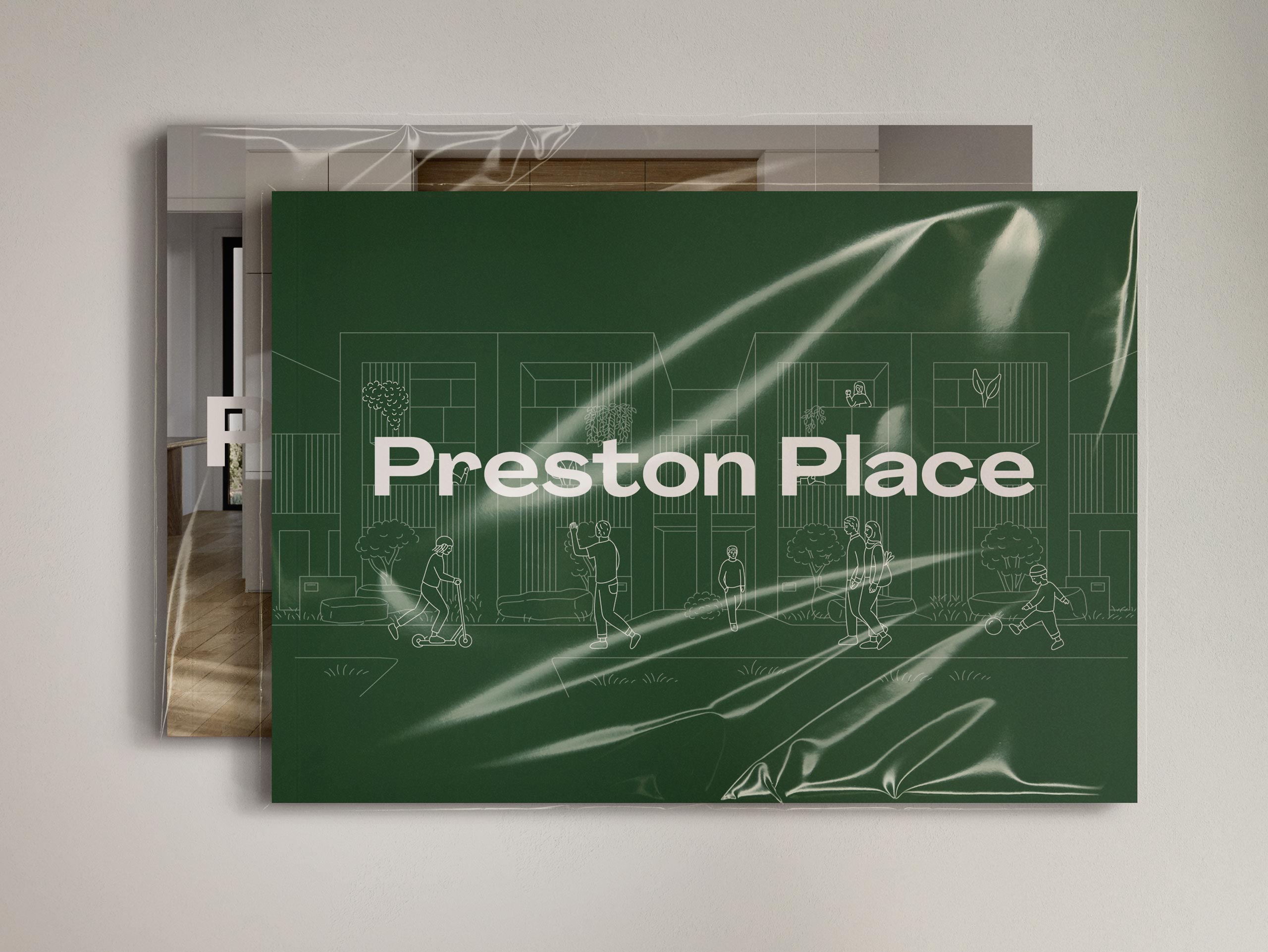
The brand takes from the creekside setting, fonts have an organic edge, colours are earthy in tone but keep a fresh autumnal vibrancy. And when people and community are at the heart of a design, you’ve got to put them in the picture! We commissioned a range of illustrations to bring the suite of 3D renders to life showing families doing what families do within the spaces.
